Overview
Albertsons Companies is one of the largest grocers in the US, and the parent of Safeway, Tom Thumb, Market Street, and many others — spanning roughly 2,500 stores. Their Home Shopping Department fulfills online grocery orders, which are then handed off to a customer at pickup through Drive Up & Go, or passed to a third-party service for delivery.
Pickers walk the same aisles as regular shoppers, filling online orders against a clock, in a store that was never designed for it. An order is “tilled” when it has been picked, closed out, and staged for handoff — and every order carries a promised ready time. Customers rely on this promise and expect little wait time when their time slot is up.
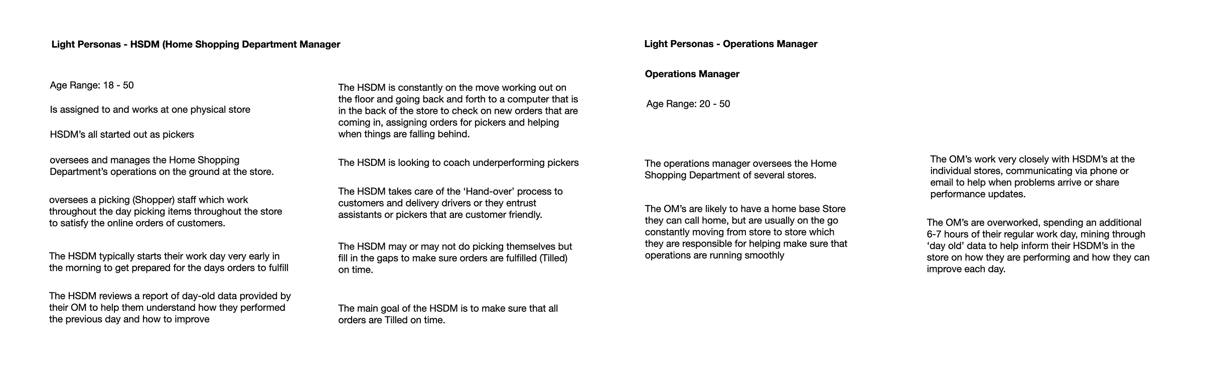
Two roles are crucial in keeping operations running smoothly on the ground, and they use data to help them make decisions about shift changes and operational improvements.
- The Home Shopping Department Manager (HSDM) — assigned to one store, almost always promoted up from picking. They are on the floor all day, walking back to a computer in the back room to check incoming orders, assign pickers, and step in wherever the shift is falling behind.
- The Operations Manager (OM) — responsible for the Home Shopping Departments of several stores at once. They spend most of the day visiting stores and coaching HSDMs by phone and email.
Problem
Neither role can see data from today. They can only see yesterday.
Each OM spends around seven hours a day pulling store reports by hand and retyping the numbers into a message written for one store and one HSDM. Across roughly 200 OMs and 2,500 stores, that is 1,400 hours a day spent transcribing data instead of running operations.
The HSDM starts the day by reading a report describing a shift that is already over, and heads onto the floor to work a new one. By the time a problem is documented, it has already cost the store and impacted the customer. The work becomes whack-a-mole: react to whatever pops up, with no way to see what is coming or how hard the next hour will be.
So the problem isn’t reporting. It’s latency and inconsistency: the data exists, but it arrives too late to act on, in 200 hand-made formats nobody can standardize or sign off on.
Approach
Our goal is to automate the data collection and communicate it in a visually consistent way, highlighting what’s important at a glance. This allows the managers to view performance in real-time, plan based on forecast, and address bottlenecks before they become an issue.
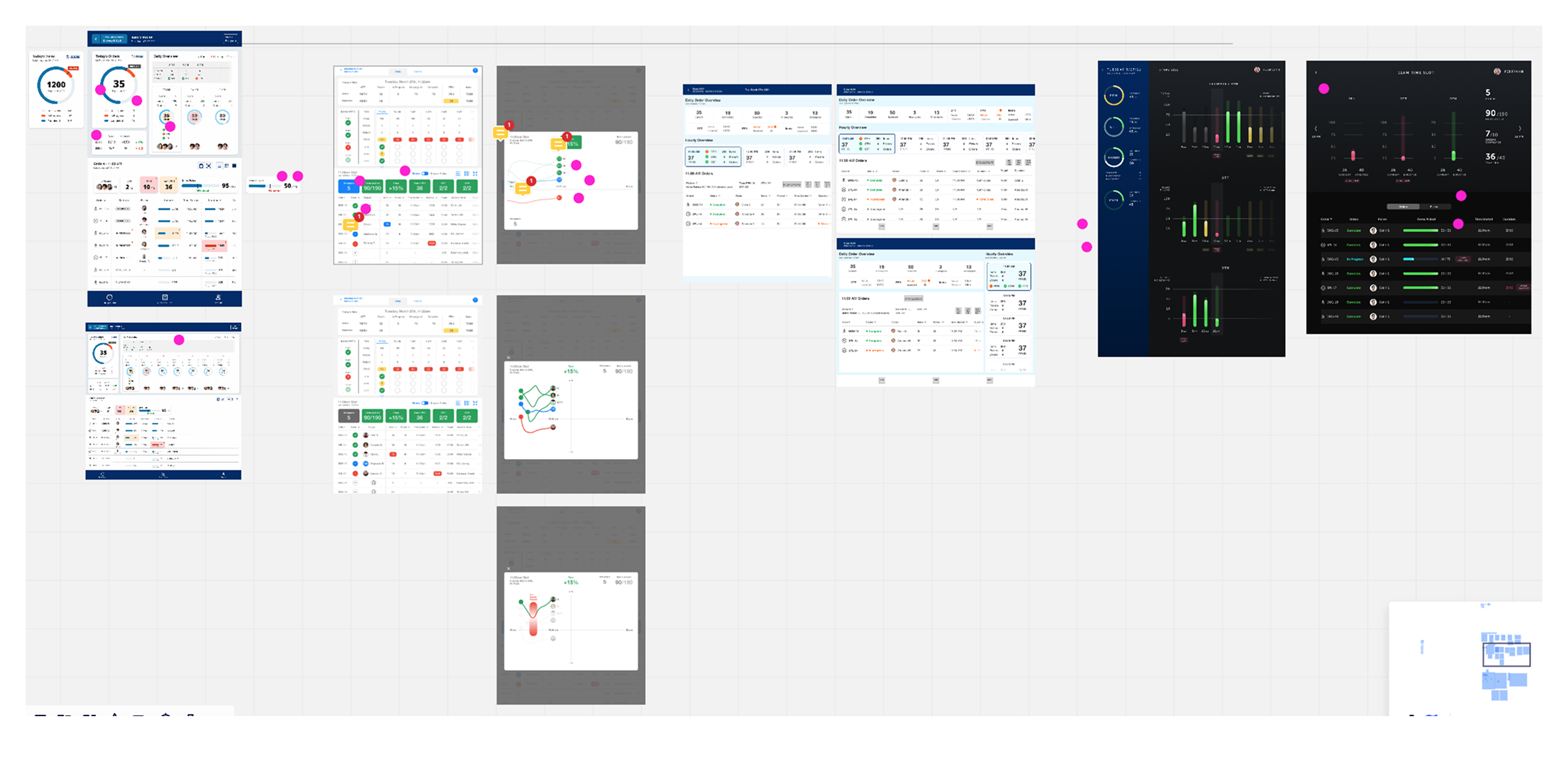
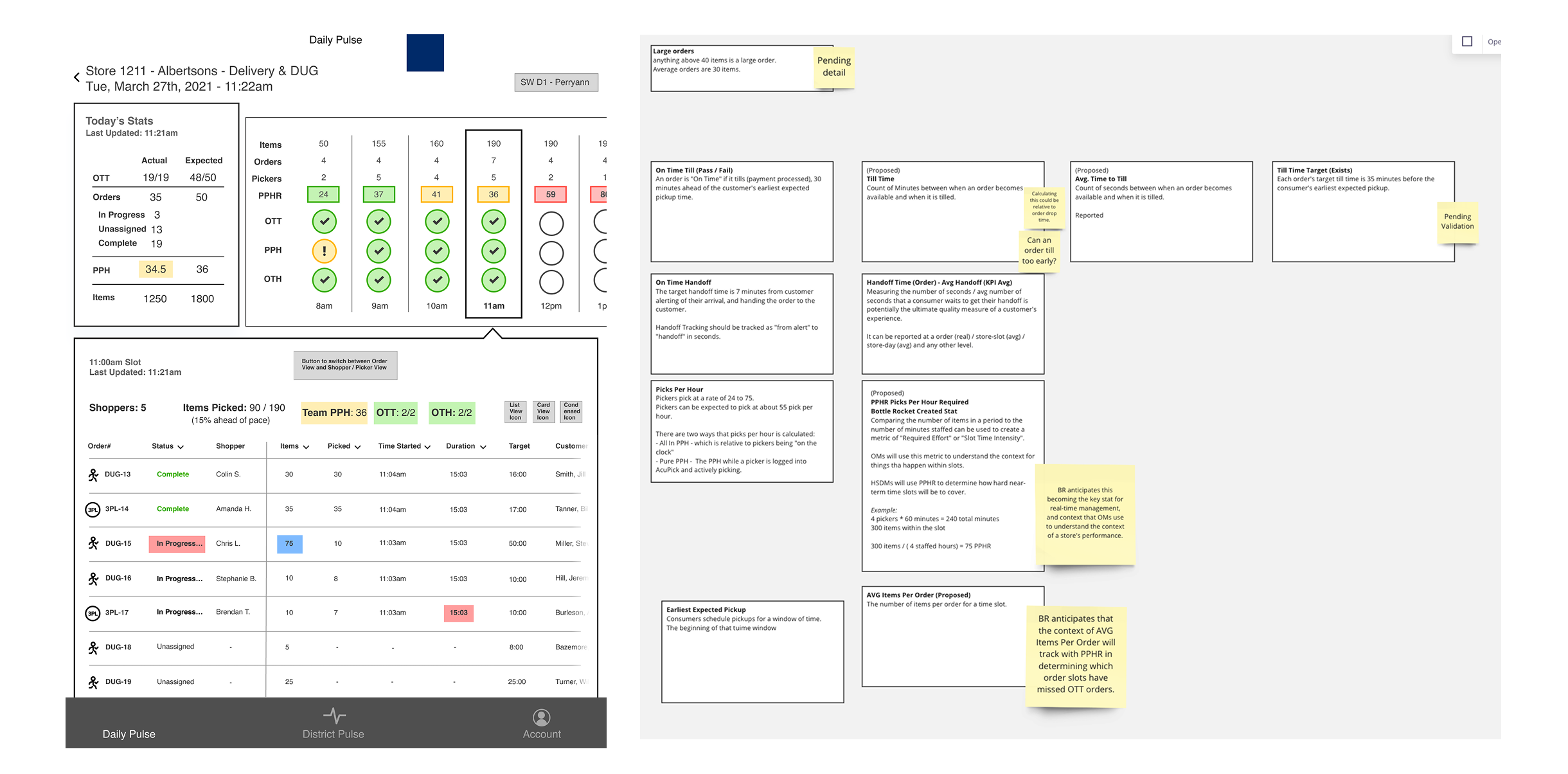
With a wireframe, light personas, data definition, and basic brand colors, we started by defining a visual direction for this new product. We ran a Design Charrette, inviting our whole design team to sketch out ideas in a week, while pressure-testing the wireframe and its content.
Simplifying Data Reporting for Managers On-the-Go
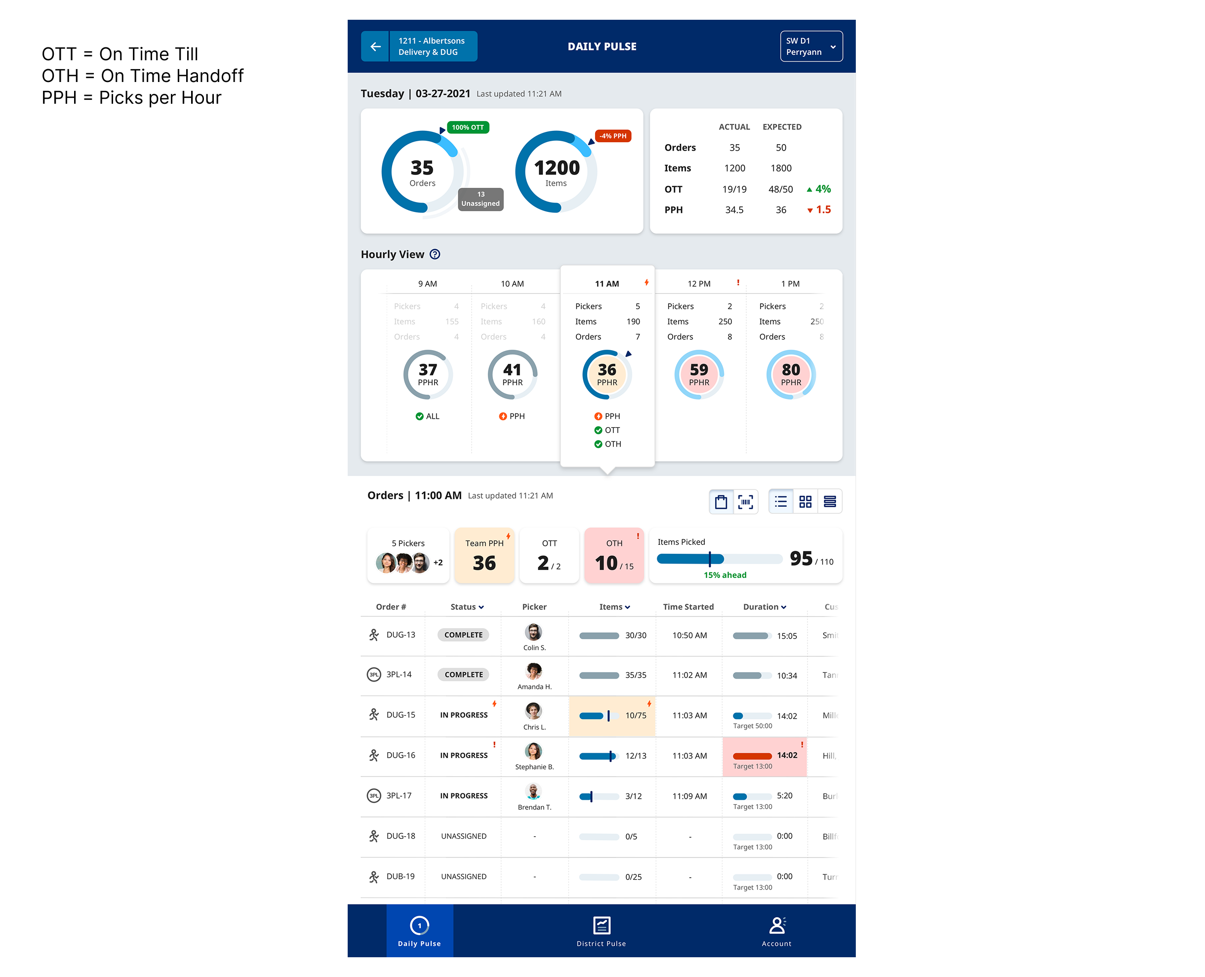
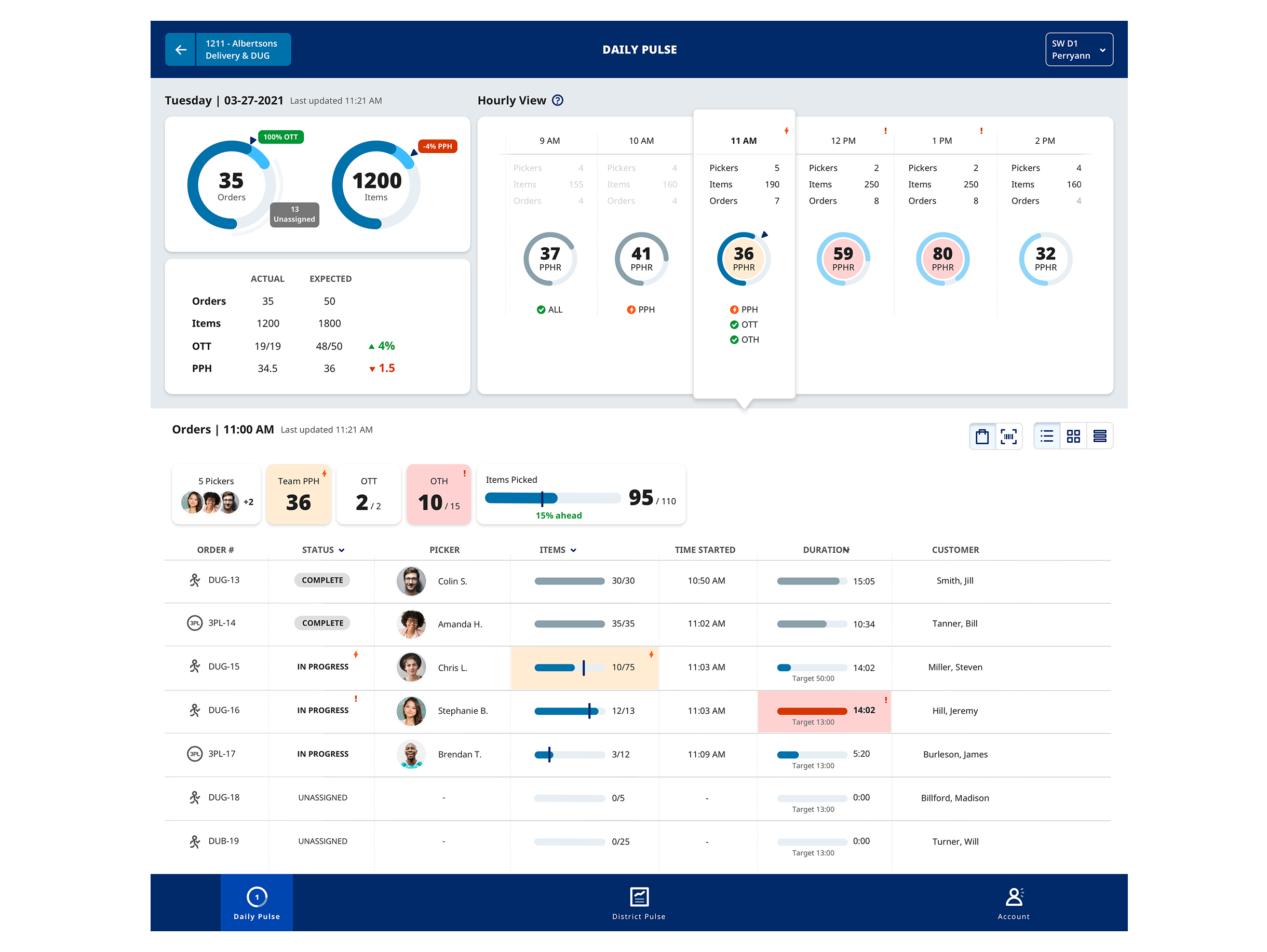
The project was nicknamed “Daily Pulse,” showcasing the metrics below as health checks on store performance.
- OTT (On Time Till) — passes when an order tills thirty minutes ahead of the customer’s earliest expected pickup.
- OTH (On Time Handoff) — targets seven minutes from the customer announcing their arrival to the groceries being in their car.
- PPH (Picks per Hour) — runs between 24 and 75, with expectation of 55.
- PPHR (Picks per Hour Required) — divides the items in a time slot by the minutes actually staffed for it, and shows required effort for that hour. It is the only number that is forward-looking, prompting managers to plan based on workload intensity.
The view opens with a store selector on top, allowing the manager to navigate between store dashboards.
A day view with radial gauges carries the day’s totals, so orders and items read as progress against a target, marked in red when numbers start to slip. “Actual” shows what has happened by the hour, while “expected” shows a derived forecast based on historical data and performance metrics.
The hourly strip breaks down the day into manageable chunks. It dims the hours already spent and holds the coming ones in full contrast. PPHR is the emphasis, so managers can adjust shifts and help with picking to get orders out on time.
Below that, the time slot expands into further details: pickers staffed, items picked against pace, and an order-level table with status, picker, item counts, start time, duration, target, and customer name. Items and duration became bars with the target marked on them, so a row that is running long is visible without reading a single figure.
Outcome
The final design accomplishes the goal of reporting data across 2,500 stores in a unified way, allowing HSDMs to plan for bottlenecks in a timely way, and allowing OMs to address performance issues without missing a beat. Higher efficiency, less overtime. A win-win situation all around.
We put the concepts through two rounds of internal feedback, then dot-voted as a team to decide which directions were strong enough to stand in front of Albertsons. Three designs were selected for the stakeholder presentation.
Mine was the top pick — and it went on to set the visual direction for the rest of the app.